topic: Vue by Milos Protic relates to: JavaScript, Web Development, GridMultiselect, Feature, Multiselect, Component on April, 15 2020
Vue GridMultiSelect New Feature - Split View
Introduction
I'm proud to say that the component I'm working on got a new feature and I want to introduce it here. In fact, I've added this some time ago, but I didn't have the time to write about it, and now is the right moment to do it.
First, lets remember what the Vue GridMulstiselect is and what is it useful for.
It's a simple component that gives you the ability to select items and display them in a table-like UI. Like a dropdown list but a little different. It requires minimal setup (single module installation) supporting the V-model and Vuex out of the box.
Also, another thing useful to know:
The component can be easily customized and turned from a simple read-only list into a grid with custom header and footer, clickable rows with details showing the data from a groupable and searchable data source...and more
If you are interested to see more, checkout the following links:
This article assumes that you have some previous knowledge about the Vue GridMultiselect component
The Split View Feature
This feature gives us the ability to split or to say, group, the selected items in our component. It is useful in situations when you need to visually distinguish where the items you have selected belong to.
Technically, the selected items view can be split into rows or columns. To split a view, you need to set the splitBy component property. The value should be the data source item property name to split the view by. Do note that, as with the grouping option, this property must be present on each item in the data source.
By default, the view is split into columns within a single row. To split the view into rows, use | separator and specify the orientation, like this state|row.
Ok, let's dive into it and create an example. First, we need to create the template.
<GridMultiSelect
  :items="items"
  item-key="id"
  item-label="name"
  v-model="selectedItems"
  title="Cities"
  split-by="state"
/>
And then, the component:
import GridMultiSelect from 'vue-gridmultiselect';

export default {
  name: "example",
  components: { GridMultiSelect },
  data() {
    return {
      selectedItems: [
        { id: 1, name: "San Francisco", state: "USA", info: "San Francisco information" },
        { id: 4, name: "Munich", state: "Germany", info: "Munich information" }
      ],
      items: [
        { id: 1, name: "San Francisco", state: "USA", info: "San Francisco information" },
        { id: 2, name: "Las Vegas", state: "USA", info: "Las Vegas information" },
        { id: 3, name: "Washington", state: "USA", info: "Washington information" },
        { id: 4, name: "Munich", state: "Germany", info: "Munich information" }
      ]
    };
  }
};
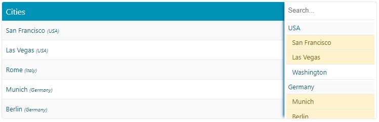
By providing a value for the split-by property, we have told the component to split the view by the state property. As you can see, we have that property on each data item in the items collection and this is important because without this, the feature wouldn't work. Below you can see the codepen showing the feature in action.
Conclusion
That's all you need to know on how to split the view on the component. Easy and straight-forward I think.
If you like what you see please give it a star on GitHub. For more in-depth explanations, visit the official documentation website.
To stay tuned do subscribe here on devinduct, or follow me on twitter. To support my work and keep me up and running, consider bying me a coffee.
Thank you for reading and see you in the next article.

Subscribe to get the latest posts delivered right to your inbox